Located in the heart of East London, Sister is a boutique hotel that has both style and soul in its very core. From check-in to check-out, the space is designed to allow guests to let loose and express themselves, eat and drink, dance and vibe. When you step through the doors of Sister, you are met with a bespoke mix of eclectic interiors, disco beats filling the air, and world-class art occupying every corner. It’s a place for individuals and communities, to come together and indulge in comfort and fantasy.
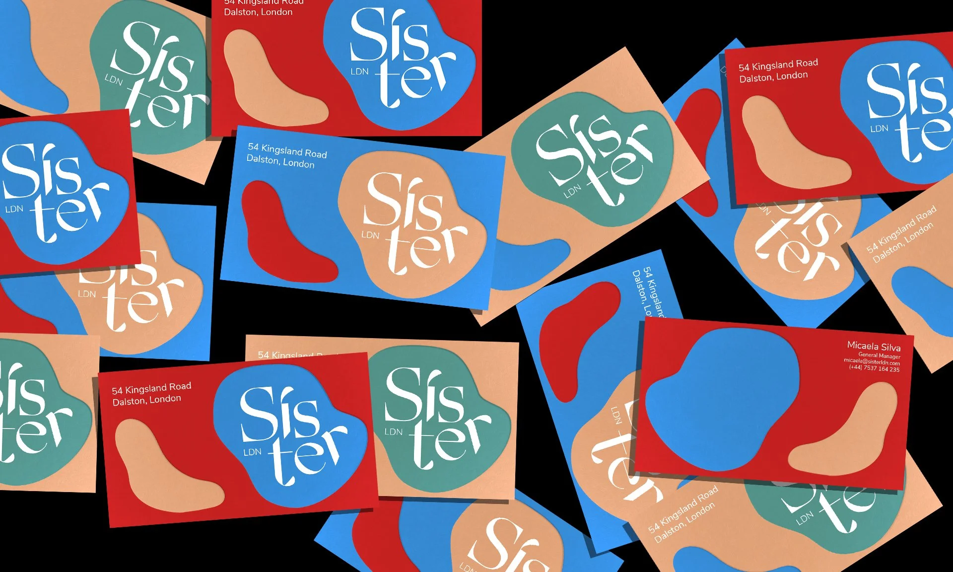
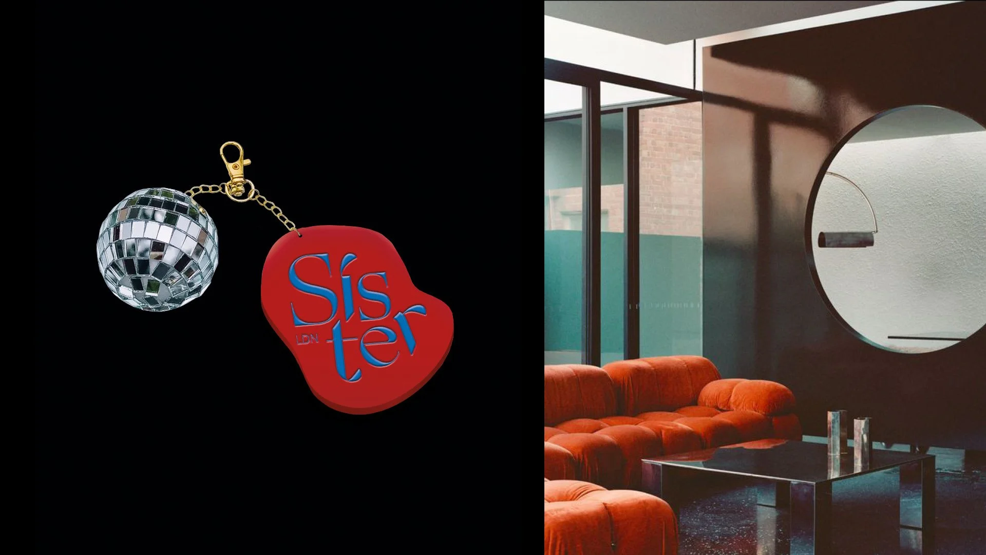
I was challenged to create the brand identity, including the name, tone of voice, plus all touch points from digital media, to merchandise and all printed collateral. I drew inspiration from the brand story, creating a name that reflected both the feeling of community, and the association to disco music. I chose an expressive and glamorous typeface that reflected the idea of disco, complimented by a modern sans serif, that as a logo mark could change its form, yet stand out as an individual. I developed a visual language of fluid silhouettes, inspired by the melting disco balls that drip down the hotel exterior and interiors. Paired with a colour palette as bold and flamboyant disco fashion, I chose imagery that evoked freedom and fantasy, layered with the fluid forms, capturing the movement and spirit of the brand.
The branded materials and tone of voice are inspired by the colourful, provocative energy found both in disco heritage and in East London queer culture - inclusive and fun, intriguing both locals and travellers alike.
🎬 Creative Direction - amber fryer
🎨 Design + motion - amber fryer


