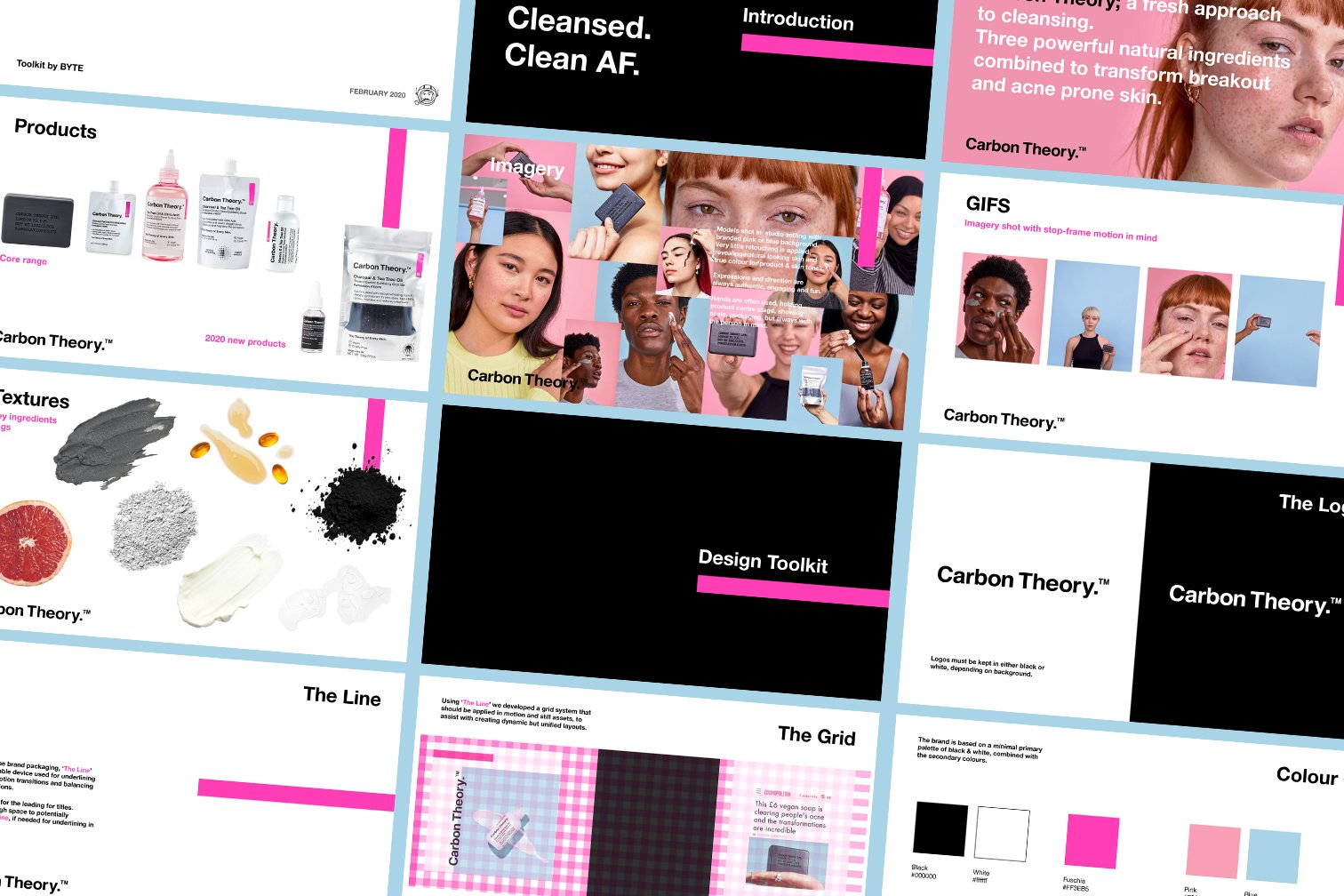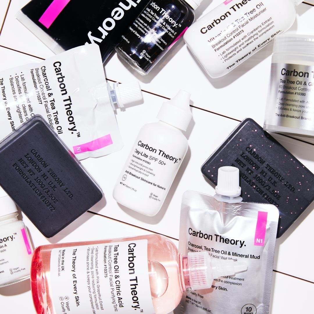

carbon theory came to us in late 2019 to help launch their start-up brand. i was challenged to develop a unique visual language that encompassed the brand’s attitude and ethos, furthering their customer awareness and reach.
I designed a range of animated and static social templates inspired by carbon theory’s packaging, expanding on their core elements and creating a visual language that was immediately identifiable.
the designs gave focus to the brand’s no-nonsense attitude and natural ingredients, allowing the people and the product to shine. finally I developed a brand toolkit that built the foundations for product expansion, creating a simple but effective design system, allowing only for a clear skin future.
🎬 art Direction - amber fryer
🎨 static + motion Design - amber fryer